
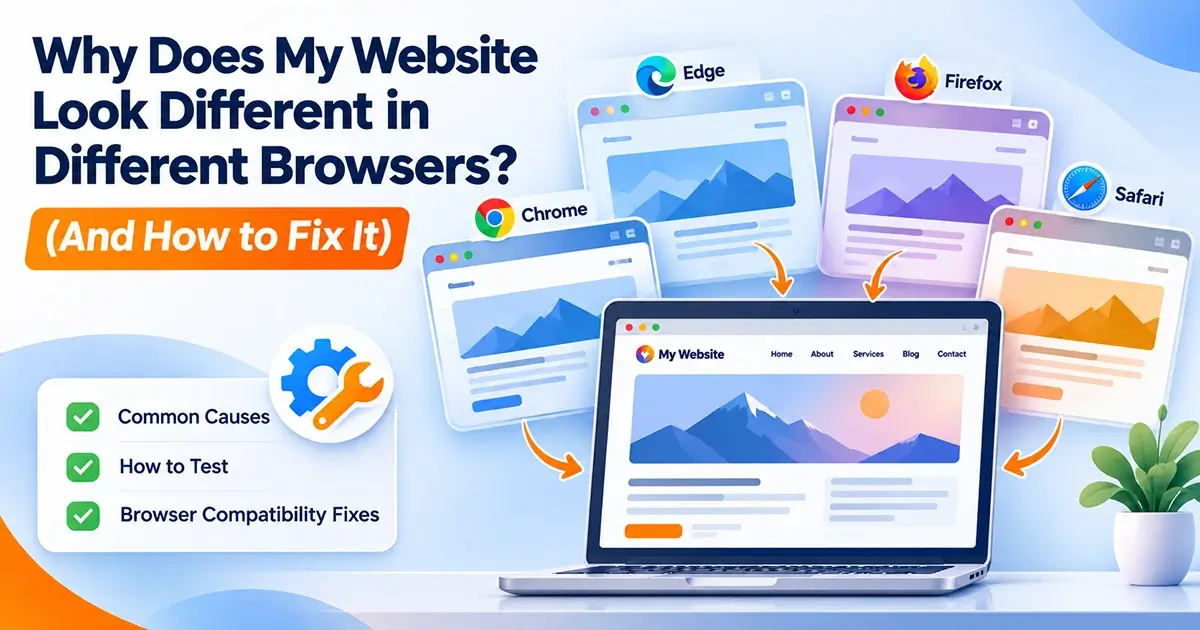
You open your newly designed website on your laptop browser, and everything looks stunning. The layout is clean, the spacing is exact, and your call-to-action buttons pop. Then, a client or a colleague opens the exact same link on their phone or a different computer, and suddenly things look broken—buttons overlap, fonts look oddly thin, or a form field loses its styling.
Why does a website look completely different across Chrome, Safari, Firefox, or Edge?
As a web design agency, we often get asked this question. The reality is that browsers render the same code differently because each uses its own rendering engine, default styles, and interpretation rules.
Let’s break down the primary culprits behind cross-browser rendering inconsistencies and how web developers tackle them.
1. Different Rendering Engines Under the Hood
At the core of the issue are the browser rendering engines:
- Blink powers Google Chrome and Microsoft Edge.
- WebKit powers Apple’s Safari.
- Gecko powers Mozilla Firefox.
Each of these engines is maintained by separate development teams. While they all strive to follow web standards set by the W3C, they implement new CSS features at different speeds and occasionally interpret ambiguous parts of the specification differently. What works seamlessly in Chrome might encounter support gaps in Safari or Firefox.
2. Font Rendering and Operating System Differences
Have you ever noticed that a font looks crisp on Windows but thin and grey on a Mac?
- The Cause: Each operating system (Windows, macOS, iOS, Android) uses its own font-smoothing and antialiasing engine. Furthermore, if a visitor’s device doesn’t have your custom web font installed and your fallback stack isn’t configured right, the browser will swap it out for a generic system font.
- The Fix: Always specify a robust CSS fallback font stack (e.g.,
-apple-system, "Segoe UI", Roboto, sans-serif) and utilize properties likefont-display: swapin your@font-facerules to ensure text remains consistent and readable.
3. Cutting-Edge CSS Features Without Fallbacks
Web designers love using modern layout tools like CSS Grid, Flexbox gaps, container queries, or modern pseudo-classes like :has(). However, older browser versions or specific mobile environments may lag in supporting these newer rules.
- The Fix: Modern development workflows utilize feature queries (
@supports) or fallback declarations so that if a browser doesn’t understand a high-end property, it gracefully defaults to a reliable layout instead of breaking entirely.
4. Default Native Form Controls
Native form elements—such as input boxes, dropdown arrows (<select>), checkboxes, and submit buttons—are styled by the visitor’s operating system and browser by default unless explicitly overridden.
- The Fix: Web designers use
appearance: none;to strip away default native styles, then handcraft uniform custom states (hover, focus, and error outlines) to ensure consistency across all devices.
5. Stale Caches After a Deploy
Sometimes, the issue isn’t a browser bug at all—it’s caching. You deploy a fix to your live site, but a visitor’s browser or CDN edge node is still serving yesterday’s cached stylesheet.
- The Fix: Implementing version hashes on asset filenames (handled automatically by modern build tools like Vite, Webpack, or Next.js) ensures that every new deployment forces browsers to fetch the fresh stylesheet immediately.
Final Thoughts
Cross-browser compatibility issues can quietly hurt your user experience and conversion rates if left unchecked. Ensuring your website looks and functions flawlessly whether your client opens it on Safari on an iPhone or Chrome on a Windows desktop requires structured testing before every launch.
Want a website built with bulletproof responsiveness and pristine cross-browser performance? Get in touch with the experts at W3Dezine today!
Suggested Meta Details for Your CMS:
- Post Title: Why Your Website Looks Different Across Browsers & How to Fix It
- Meta Description: Discover why websites render differently in Chrome, Safari, and Firefox. Learn the common causes of layout bugs and how W3Dezine builds cross-browser compatible sites.
- Article Section: Web Development / Web Design Tips
- Article Tags:
Cross-Browser Compatibility,Web Design,CSS Rendering,Website Troubleshooting,W3Dezine